Independent practice / 13 November 2026
Personal website redesign: more content, softer boundaries
How Julian Cooper’s portfolio evolved through three editorial design iterations, with real screenshots, specific feedback and a reusable review checklist.
The brief
Personal identity, selected work and a public resource library, with an editorial reading experience.
Scope / 12 November 2026
English and Chinese homepages and resource library. Existing project destinations, search and contact paths retained.
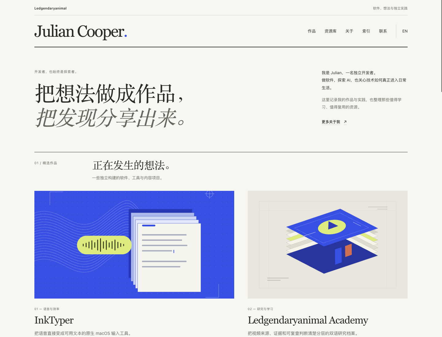
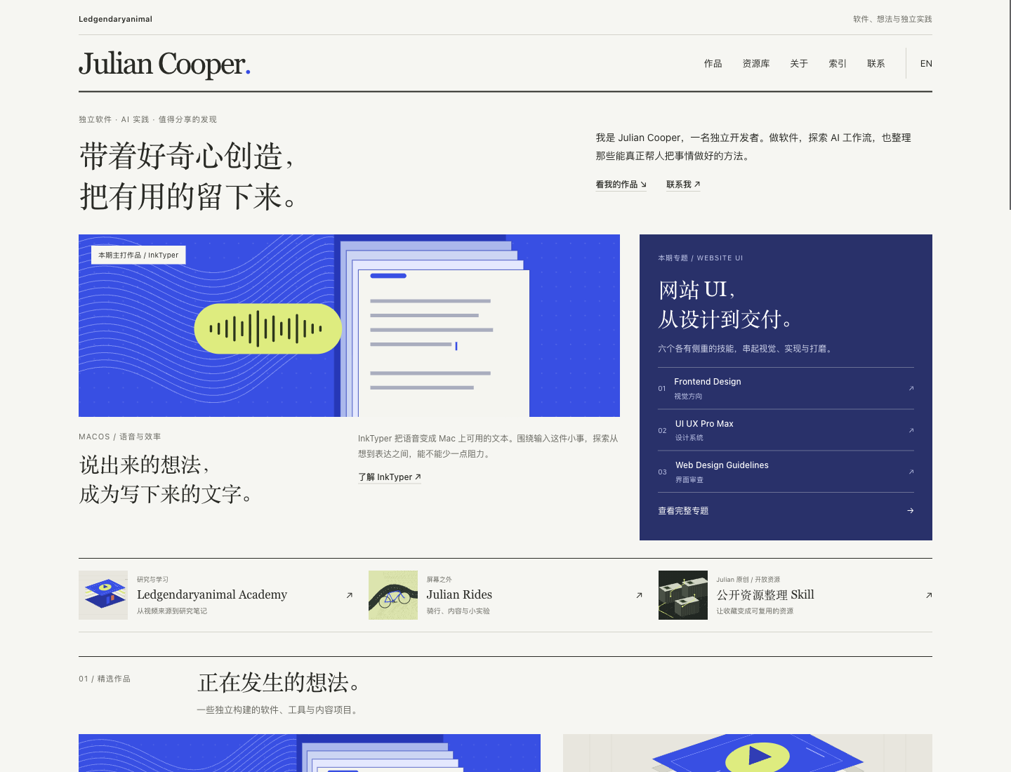
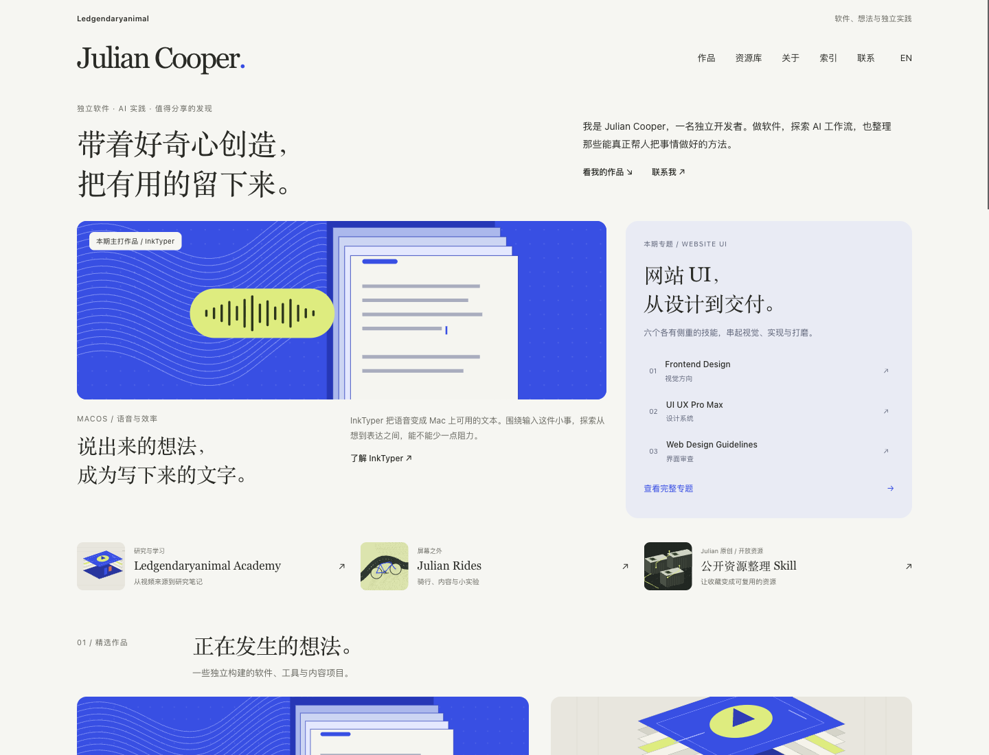
An editorial direction needs a reading order.
The goal was to help visitors understand who I am, what I build and which resources they can reuse. The first layout used a publication-style masthead, serif headings and a paper-colored background. Projects and resources followed the personal introduction.
The direction was coherent, but the opening was too sparse. My feedback was that it felt too simple and empty. A visual style alone did not give the visitor enough to explore.
Fill the page with reasons to keep reading.
The second iteration shortened the opening and brought a featured InkTyper story into view. A website UI skills sidebar gave readers another path, while three smaller links connected the software, learning and resource sections. Project descriptions explained the problem each project addresses and what visitors can explore.
This improved the amount of useful content on the page without inventing testimonials, usage figures or business results. The important choice was which real content belonged near the top.
Keep the hierarchy; soften the separators.
My next feedback was that there were too many straight lines and the borders were too pronounced. The third iteration removed decorative section and item rules, changed the dark sidebar to pale blue-gray, and introduced moderate rounding on artwork and panels.
Spacing, type scale and background tone now do more of the grouping. Inputs and selected controls still have visible states, and keyboard focus remains clear. Softening the page should not make interaction harder to see.
What was checked, and what this proves.
The redesign records include desktop and mobile browser checks, bilingual navigation, resource search and filtering, and empty-result recovery. Existing navigation and resource tests passed. These checks support layout and interaction claims; they do not establish a traffic or conversion improvement.
A review checklist to reuse
- Can a new visitor understand the person, the work and the next step from the opening?
- Does each section offer real information or a useful destination?
- Can typography, spacing or background grouping replace an unnecessary border?
- Are links, focus, search and mobile reading still usable after visual changes?
Revisit the decisions
Editorial redesign ↗ · Content density ↗ · Softer surfaces ↗